Start With the Look You Need, Not a Material Name
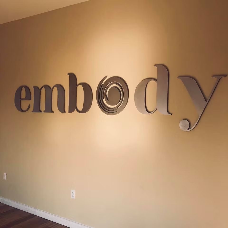
A business owner may describe the project as raised letters, three-dimensional letters, lobby letters, building letters or a logo that needs depth. Those descriptions are enough to begin. Our job is to translate the desired appearance, installation surface and exposure into an appropriate construction plan. HDU is often a strong choice for thick exterior letters because it is lightweight, routes cleanly and does not rot like wood. Acrylic, layered materials and applied faces may also be considered when the design calls for a polished or contrasting surface.
The first decisions are the overall width, letter height, depth, color and mounting method. A photograph of the wall, a rough dimension and a usable logo file allow us to identify practical proportions. We can manufacture individual letters, complete words, dimensional logos and layered emblems. The pieces are supplied for installation by the customer, sign company or local installer; nationwide shipping is available.
Letter Depth, Scale and Readability
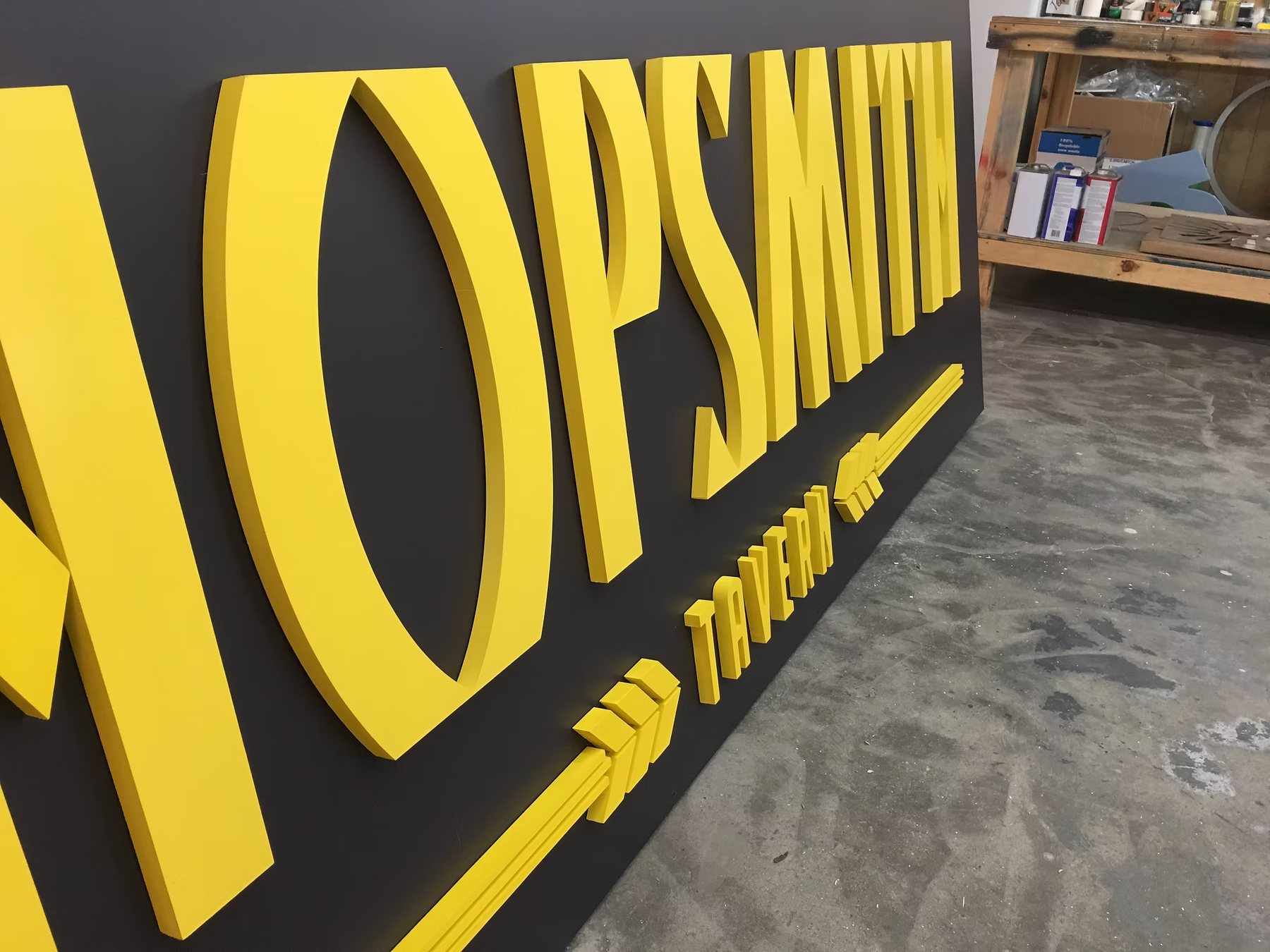
Depth changes how lettering reads. Shallow pieces give a clean, understated shadow line, while thicker letters create stronger relief and remain visually substantial on large walls. The right depth depends on viewing distance, letter height and the surrounding architecture. A very thick letter is not automatically better; the proportions should support the typeface rather than make delicate strokes appear heavy.
Readability also depends on spacing and contrast. We review the supplied artwork for strokes that are too thin, interior openings that may close up and script connections that could become fragile. When a design needs adjustment for manufacturing, we explain the issue before production. The goal is to preserve the brand while making the finished lettering practical to cut, paint, pack and install.
Choose the look of your letters
| Construction | When to consider it |
|---|---|
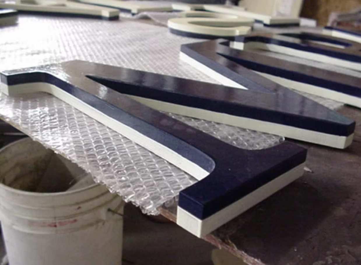
| Painted HDU | For substantial depth, shaped logos and carved details. Our 15-pound sign-grade HDU can be supplied raw, primed or painted. |
| Acrylic | For smooth faces, crisp edges and a clean logo presentation. Share the required color, thickness and whether the letters will be indoors or outdoors. |
| Acrylic faces on HDU | For a smooth letter face combined with the depth of an HDU base. The face, edge color and finished thickness are agreed with your artwork. |
Send both the available wall width and the height you have in mind. A 12-inch letter height does not tell us how wide the full business name will be. The approved layout should show the complete line width, spacing and tallest letter so the set fits the wall.
Plan the mounting before we cut
Include a photo of the surface and tell us whether it is masonry, stucco, metal, wood or an interior wall. Ask for the mounting preparation and installation pattern you need in the quote. The pattern sets the spacing; it does not determine whether the wall or fasteners can support the letters.
Ordering Letters From Your Artwork
The best starting file is a true vector such as AI, EPS, SVG, DXF or a vector PDF. Vector paths allow the letters and logo to be scaled without losing edge quality. A high-resolution image can sometimes be redrawn, but artwork cleanup or recreation may be quoted separately. Include the desired overall width or letter height so there is a fixed scale rather than an open-ended file.
A useful quote request also includes quantity, material preference if known, thickness, finish, shipping ZIP code and a photograph of the intended location. Sign shops can state whether they want raw, primed or fully finished components. Direct customers can simply explain the result they want. We will help you choose the thickness, finish and mounting preparation.